The Living Article: Building a Document That Fights Back
Dec 13, 2025
We’ve all been there. You’re reading an article and halfway through it says something bold, maybe even a little careless, and your brain instantly disagrees. At that point you usually have two choices. You scroll all the way to the bottom to leave a comment that may or may not be read, or you just close the tab and move on with your day. Either way, the conversation stops before it ever really begins.
It struck me that most online writing works like a monologue, not a dialogue. And somewhere in that frustration, this slightly strange idea started forming.
What if reading was less consumption and more negotiation? What if the article becomes a sentient being that you can argue with? Can the reader poke holes in the article and the article pushes back, stretches, squeeze. But The moment you interact, it stops being mine. It becomes something shared, unstable, alive. Slightly uncomfortable but very interesting to watch happen.
Designing UX for Dialogue
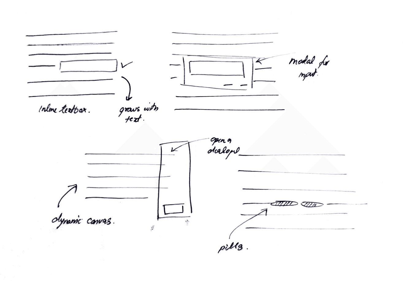
I went through a bunch of interaction ideas before landing on this. I tried text boxes, chat panels, popups, even those pre-cooked “agree / disagree” chips that look like they were made for a survey, not a conversation. None of them felt natural. They all added distance instead of reducing it.
Scratching text out and writing directly over it felt different. It felt physical in a way the web rarely is. More like leaving notes in the margins of a book than filling a form on a website. It wasn’t a dramatic aha moment or some poetic metaphor drawn from the real world. It was just one iteration after another until this one finally felt right.
A little messy, a little literal, but honest (I guess?)
How it actually works
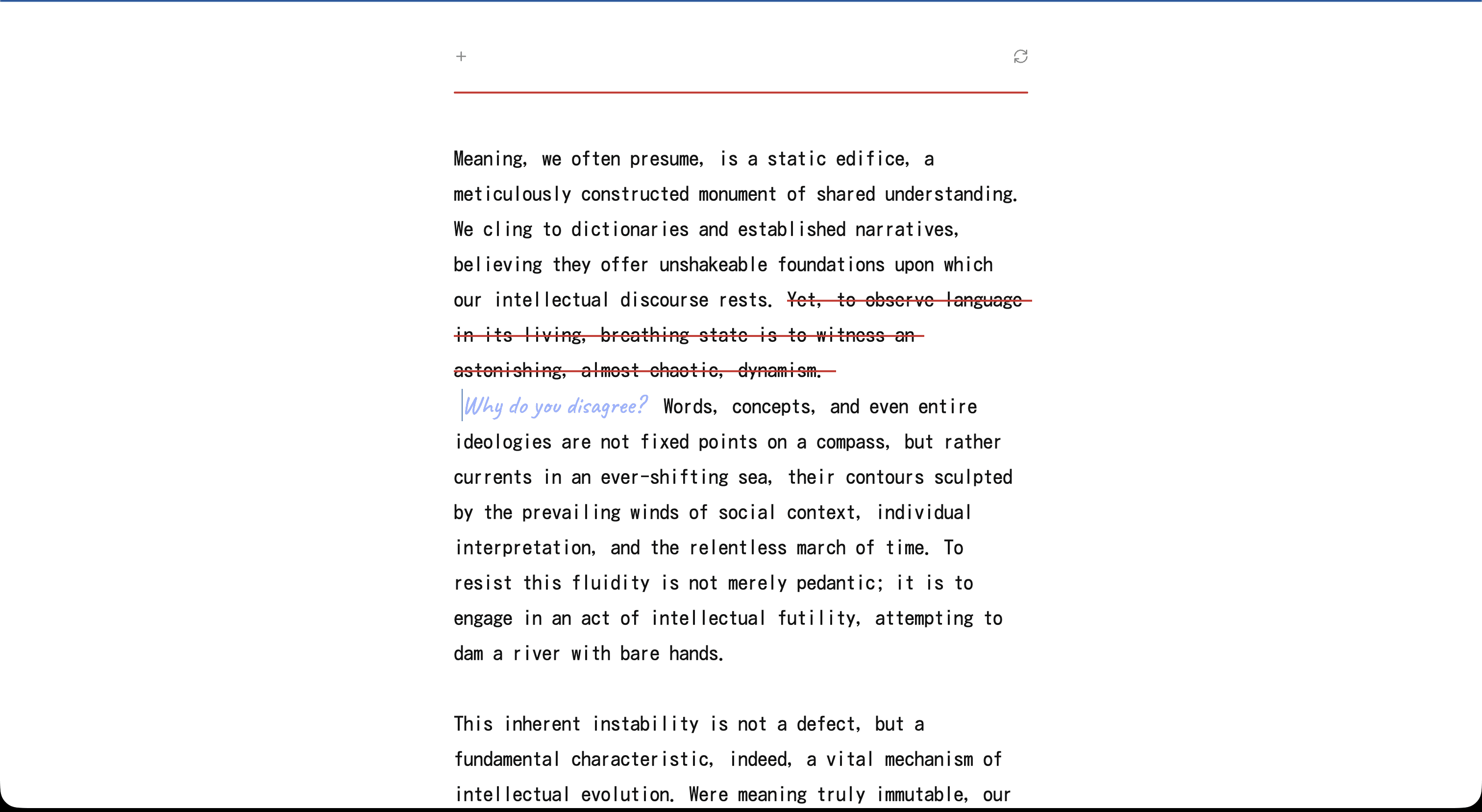
The interaction is simple. You click a sentence, it gets a red strike through, and a little handwritten textarea shows up right there in the sentence. You type your objection or your version of the thought, press enter, and the document thinks for a second and starts rewriting itself from that point forward.
Behind that moment, a lot is happening. The text is split into sentences, each tagged with an ID so the system knows exactly where you intervened. When you scratch one out, the app deletes everything that follows and sends three things to the model: the sentences before it, the struck sentence, and your handwritten note.
On the model side, transformers turn text into embeddings - basically vectors that represent meaning and context rather than raw words. (My friend Nancy Jain has a really good primer on this if you’re curious.) When you edit a sentence, you’re not just swapping text visually. You’re changing the embedding space the model uses to predict what comes next. That small shift is what lets the article continue naturally from that point instead of restarting or drifting into a different topic.
This part matters. The rewrite should feel like the same article, just redirected, not a new essay hijacked by your one disagreement. It needs to stay consistent in tone, pace and intent, and it definitely shouldn’t start inventing ideas the original never intended. The goal isn’t to create a counter-argument for you, but to fold your objection into the narrative and keep going as if the article thought it through and adjusted itself.

Giving it some Character
Not every disagreement should be accepted. Some edits will be incoherent, irrelevant, or simply destructive, so there needs to be a way to intercept user input before it reaches the rewrite stage. To handle this, I built a lightweight validation layer using the model itself rather than manual checks. When the user submits feedback, it first goes through a separate model call designed to classify the input. If the feedback fails basic quality and relevance checks, the model responds with a single token <REJECT> instead of a rewrite.
This rejection logic functions as the internal moderation layer of the system. It prevents the article from degrading into noise and ensures that only meaningful input leads to a rewrite. Instead of implementing a hard-coded if/else tree in TypeScript, this behaviour is defined inside the model’s system prompt. The AI is instructed to act as an editor, not an unconditional text generator.
The model evaluates the user’s text against three criteria:
Coherence | Intent | Nuance |
Is the input actual language or just random characters. | Is the user trying to contribute or just vandalize. | Does the edit improve or degrade the original writing. |
Examples that are rejected: asdfghjkl, spam, keyboard mashing | Rejections: trolling, irrelevant memes, profanity with no argument. | Rejected: replacement that reduces clarity or substance without justification. |
Examples that are accepted: meaningful confusion or critique like “This part is unclear.” | Acceptance: disagreement that may be direct, blunt, or emotional, as long as it has content. | Accepted: edits that simplify, clarify, or challenge reasoning constructively. |
The system prompt includes a clear instruction:
If the feedback fails these criteria, respond with only
<REJECT>
Since responses stream token-by-token, rendering <REJECT> directly would cause visual flicker. To avoid this, the app buffers the first portion of the stream in memory. If <REJECT> is detected inside the buffer, the UI switches into a rejection state. The handwritten note is then removed and the original sentence is restored. If no <REJECT> flag is found, the rewrite proceeds normally and the new text is streamed into place.

Metaphors, Metaphors and More Metaphors
I also wanted the interface to feel a little surreal. The whole experience is strange already, and I wanted the visuals to lean into that rather than hide it. I kept imagining what this would look like if it existed in the physical world, if you tried rewriting the same piece of paper again and again on a typewriter. The page would wear out over time, the ink would bleed, the texture would break down. Eventually, the paper would look tired, like it’s been through multiple arguments.
I couldn’t fully recreate that physically distressed texture, but I built a suggestion of it. I added a noise overlay in CSS and increment a wear level every time the article rewrites itself. With every disagreement, the page gets slightly more aged, less pristine. It’s simple in implementation, just a variable bumping a filter but hopefully it gives the document a sense of history instead of stateless text that resets each time.

Not every edit gets a response. If the model returns <REJECT>, the system treats it as a non-starter. The handwritten note dissolves and the sentence snaps back into place. Something so satisfying about this interaction, lol.
Scroll locking was necessary too. On rewrite, text height changes drastically, so I snapshot the container height at the moment of rewrite and release it only after the final token arrives. Mobile would crumble otherwise. You don't notice it when it works, but if I remove it, the whole magic collapses.
One last bit about timing. I deliberately added a pause before streaming the response back from the model. The text doesn’t appear instantly. It arrives with a slight delay, like the article is taking a moment before answering you. That pause changes how the response is perceived. It no longer feels like a cold, precomputed output. Mimicking how one responds in an dialogue, I know it sounds a bit philosophical when put into words, but in practice it works.
These details are easy to miss, but they matter. In a world obsessed with speed and instant answers, choosing to slow something down is a design decision. As a UX designer, that’s the part I enjoy most.
Learnings?
I’d be lying if I said I wasn’t tempted to wrap this up with some deep, philosophical learnings. Big insights discovered while building a solution in search of a problem. So, in that tradition, here we go. I built something mildly stupid, but it did make me think.
Every once in a while, technology forces designers to rethink the basics. The smartphone moment did that. Suddenly, everyone had computing power in their pocket, and experiences that had been designed for desktop screens for decades had to be reimagined entirely. Then came the jump from 2G to 3G and 4G. Streaming large amounts of data became normal, and that changed how we thought about content, media, and attention.
I see generative AI as another one of those moments. We now carry something close to super-intelligence around with us. That raises new creative questions for designers. What does authorship mean? What does interaction look like when the system can respond, adapt, and evolve? How do we design experiences that feel thoughtful instead of overwhelming?
I don’t have answers yet. This project doesn’t either. For now, it’s just a way to explore those questions in a small, tangible form. The rest, I guess, time will tell.Try it out, maybe?